Azoth Biotech — Inspired by Nature





Client / Biotechnology
A biotech house growing medicine, materials and market-ready brands out of mushrooms.
Azoth Biotech was the parent client — the full remit: brand identity, print & packaging collateral, a running social-media system, and website design. Under that umbrella we grew a family of brands, each with its own voice.
- Role
- Web & Graphic Designer
- Years
- 2020 — 2023
- Based
- Noida, Uttar Pradesh
- Site
- azothbiotech.com
Make biology feel engineered.
Twelve directions were drawn — helixes, flasks, monograms — before the answer arrived from the organism itself: a mycelial network, clipped by a perfect circle, precise enough for a pharma label and alive enough for a festival post.
The monogram began as a culture: strains of mycelium branching across a petri dish, the letters of Azoth hidden in their forks. The sketch set the rule — hyphae on one diagonal, branches on the level — and the final mark tightened it onto a strict grid, rounded at every tip like living growth.
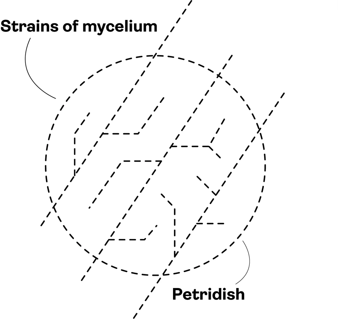
iThe culture — strains of mycelium, a petri dish
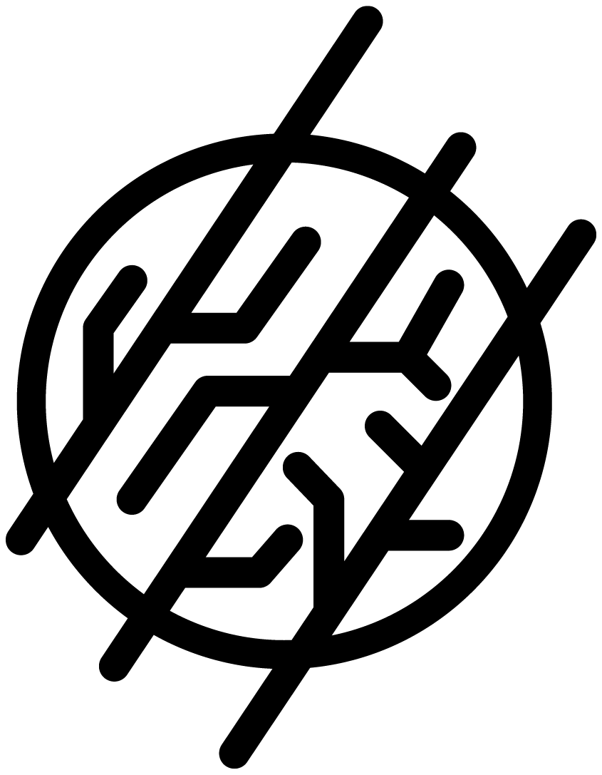
iiThe grid — open strokes, rounded at every tip
iiiThe seal — clipped by a circle, in culture teal
The chrome stays neutral so one teal reads as the signal.
Type — Display
Geometric grotesque
A confident geometric sans carries the wordmarks — even strokes, circular bowls, engineered like the lab it speaks for.
Type — Text
Neutral humanist sans
Body and captions stay in a quiet humanist sans for long-form legibility.
Culture teal
The signal — the mark, and one accent per surface.
#28A898
Lab navy
The voice — the wordmark, headlines, the reversed ground.
#283078
One house, many fruiting bodies.
Four lines were proposed under the parent, each with its own mark while staying inside the house's teal-and-grey grammar — sheets that show the system thinking: lockups, reverses and typography tested together, not logo by logo.
Azoth Biotech
The house — parent client
Naturalist Nootropics
The field-notes voice.
Functional-mushroom nutraceuticals
Mushroomworks
A mushroom at the hub of a gear.
Mycelium materials — packaging & vegan leather
MycoActives
Bolt-stemmed, energy-first.
Active mushroom supplements

Kavaka
The Sanskrit name, drawn as a mark.
Proposed line
Apart — a separate client
Mycoveda sits apart — a separate client. Its mark is an arched window onto the forest floor: mycelium branching through the upper half, a mushroom cap at its heart, and rays fanning out beneath it, the fungus as a source of light. Under it, the name in a rounded geometric hand — myco, fungi, joined to veda, knowledge.
Functional-mushroom nutraceuticals
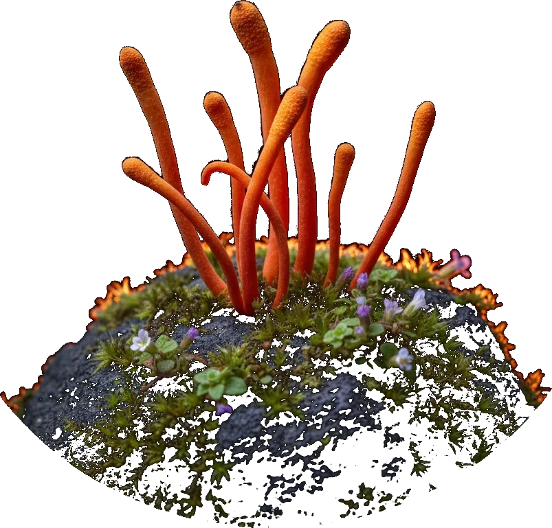
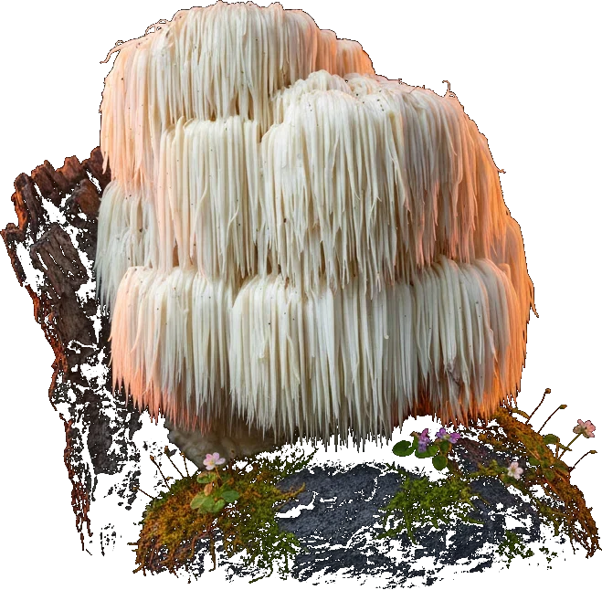
Cordyceps and lion's mane, reframed as everyday performance — an editorial social system that teaches the science while it sells.
Packaging — Brain Fuel
The first product to wear the system: a 100 ml nootropic tincture — Cordyceps militaris and Lion's Mane with L-Alpha GPC, L-Theanine and Bacopa. The label turns the wordmark on its side and lets one condensed line, Brain Fuel, do the talking; the rest stays white, like the lab it came from.
The social system · Naturalist
18 posts
Mycelium materials — packaging & vegan leather
Growing packaging and leather from mycelium — a brand for a material that replaces plastic and hide, told with hard numbers and clean product frames.
The system sheet
The MW mark — the cap that grows into an arrow.
The mark, its lockups and its reverses, tested together on one sheet.
The social system · Mushroomworks
14 posts
The parent, in its own voice.
Beyond the family brands, the parent ran its own programme — research, training and certification, held together by the same identity.
The road not taken.
For every mark that shipped, a wall of ones that didn't. The exploration sheets behind Azoth and its brands — dozens of directions pressure-tested before the finals earned their place.